Building simple and elegant UI with Livestax
Designing a great and consistent user experience is hard. This is especially true for a software application like Livestax which has the vision to empower individuals and organisations to create solutions to their own pressing problems.
The Livestax user interface comes to life through the power of apps that can communicate with each other to build powerful yet light and simple user experiences. It’s the combination of several apps that provide developers and organisations the ability to assemble meaningful solutions to any given problem. While this is great for software and feature extension because apps can be designed and developed in small “chunks” to approach problems as they appear, it does make having a consistent user experience difficult.
This was challenging to overcome and to balance. By enabling flexibility to virtually build any software solution, user interface control is lost and therefore this can impact the overall user experience.
Considering real world use cases we set out to discover and build a re-usable modular design system that could facilitate the Livestax app building process. The vision was to unify the core application with the apps making the whole of Livestax look and feel like a beautiful and seamless user interface.
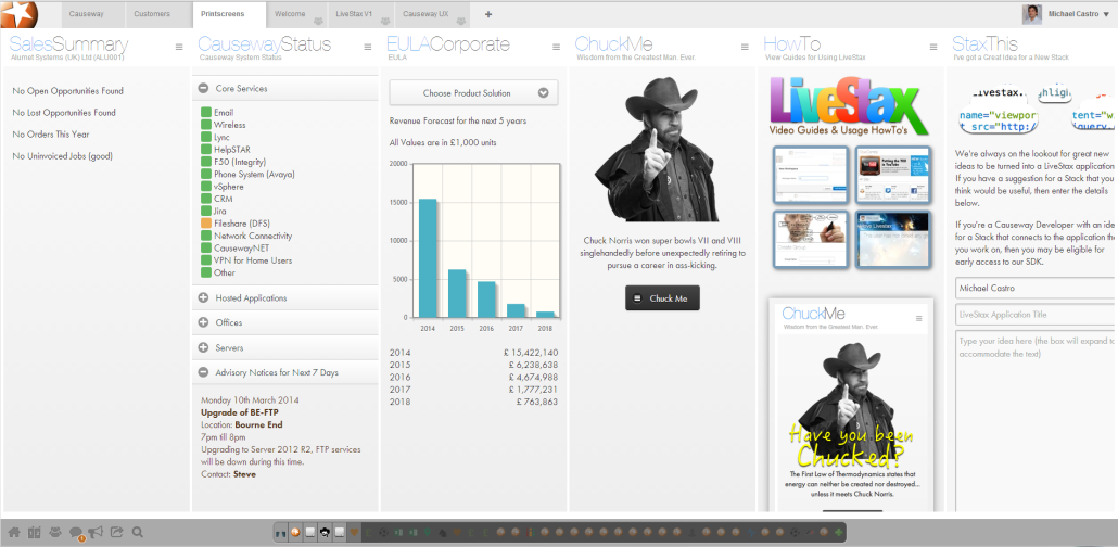
One of the biggest challenges that we faced along our journey was related to the vertical nature of the Livestax apps. In fact, due to the apps form factor and the mobile first approach, on a desktop the Livestax environment was initially looking and feeling like several individual mobile app screens placed next to each other. This was visually heavy and as soon as data was loaded to several apps on the same page the user interface looked and felt cluttered.

One of the initial prototypes for Causeway Technologies using the early stage Livestax platform
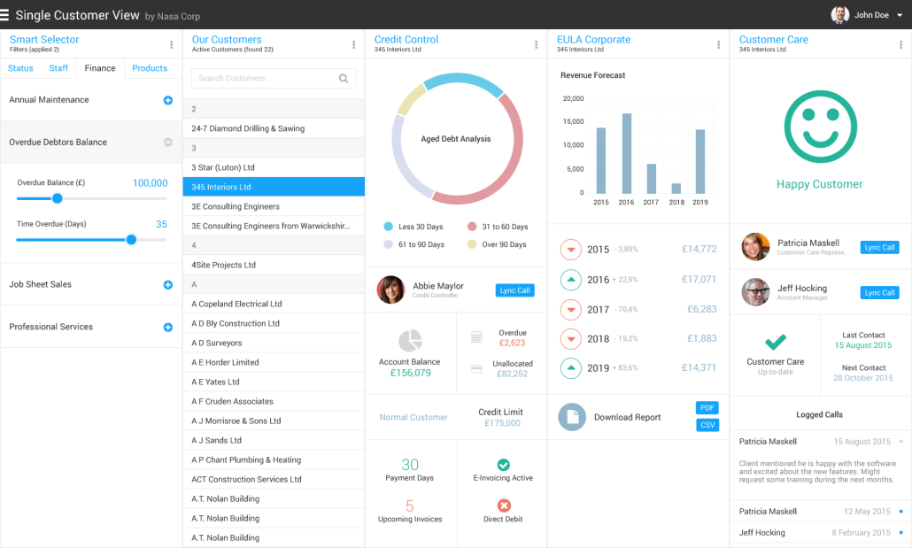
As we iterated through more than 60 different UI versions while building, designing and testing app prototypes with real users we made a few discoveries that enabled us to build what today is the official Livestax Theme:
On a conceptual level, having an app doing one thing and doing it well simply works. When more features or functionality is needed it’s probably time to split the needs and create another app. This also enables a great separation of concerns and since apps can easily communicate with many different apps through the Livestax Communication Layer, this will provide the ability for the same app to be reused in many different use cases. This is fantastic and offers a powerful way to save development time while still enabling functionality extension in the future as apps can be built when needed and integrate in a key chain like fashion.
On a visual level, having the apps using a white background is crucial to keep the user interface light and clean as several apps are placed together on a page. This also integrates well with the Livestax core application and enables the users to create their own experiences by combining apps together in whatever way they want or need.
Colour should be used only on specific elements that need to be more prominent than others. Colours should also create meaning at a glance. The main interaction colour should only be used where UI elements are selected or when a call to action is needed.
Font sizes were optimised so that nothing on the screen overpowers the other elements while still enabling visual hierarchy and structure.
As apps are placed next to each other and a Livestax page becomes populated with apps we need them to connect somehow so that the interface feels and looks like a whole, a sum of all its parts and not many different parts. We achieved this by consistently building components and small building blocks that “touch” the edges of each app and connect all of them through thin, elegant and light grey lines. This was one of the major breakthroughs and made the whole interface (several apps) greater than the sum of its parts.
An app should never be approached in isolation but as part of a bigger ecosystem. Any app will be placed next to other apps and therefore it’s important to understand that as app designers and developers we are not in control of how the app will be used inside Livestax. By respecting the UI guidelines and consistently using the Livestax Theme we will enable the whole interface to make sense and never have an app overpowering all the others, no matter where the user decides to place the app on the space or page.
Building enterprise grade UI components is key to enable individuals and organisations to build great experiences for their own user needs. We want to empower developers to build beautiful, meaningful and usable user experiences fast and the UI components will certainly help.
Some of the latest apps we have been building are the validation we needed that the theme is currently on the right track.

Beautiful and elegant user interfaces that scale, extend and enable legacy and on-premise software to “work the web way” can be built and we will empower this as much as possible.

Designing and developing Livestax apps can be fun and rewarding. We invite developers and organisations to give it a go. IT teams and other organisation departments can use Livestax and use the theme to delight users, solve user and business needs while still remaining flexible and agile.
Users expect and deserve consumer quality interfaces in their daily enterprise worlds. Let’s build strong, fun and great enterprise software for the 21st century. Let’s build meaningful and engaging user experiences with a beautiful and elegant user interface.
